Dashboard Design and Development
Hi, my name is Ewa Tuteja. I’m into data visualisation – with and without Tableau. I help businesses and organizations to see and understand their data.
Hi, my name is Ewa Tuteja. I’m into data visualisation – with and without Tableau. I help businesses and organizations to see and understand their data.
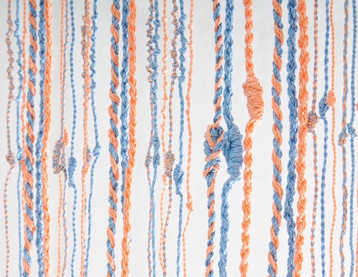
My 7+ years experience spans from data preparation and data analysis to development with Tableau, d3.js, Adobe Illustrator and even yarn – allowing me to provide end-to-end solutions to clients.
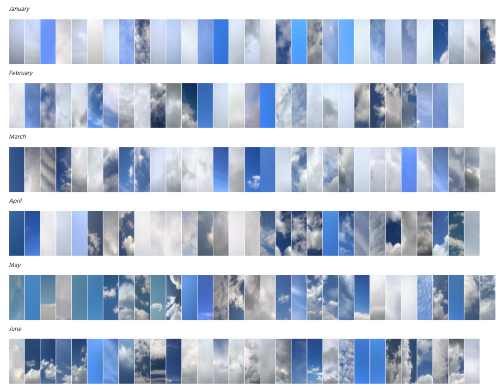
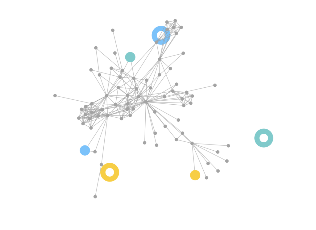
In my data visualization career I have completed many diverse projects. My work is, in general, about enabling understanding of a subject matter or a phenomenon through mediums that are engaging, e.g. interactive or physically tangible or simply because they are beautiful.
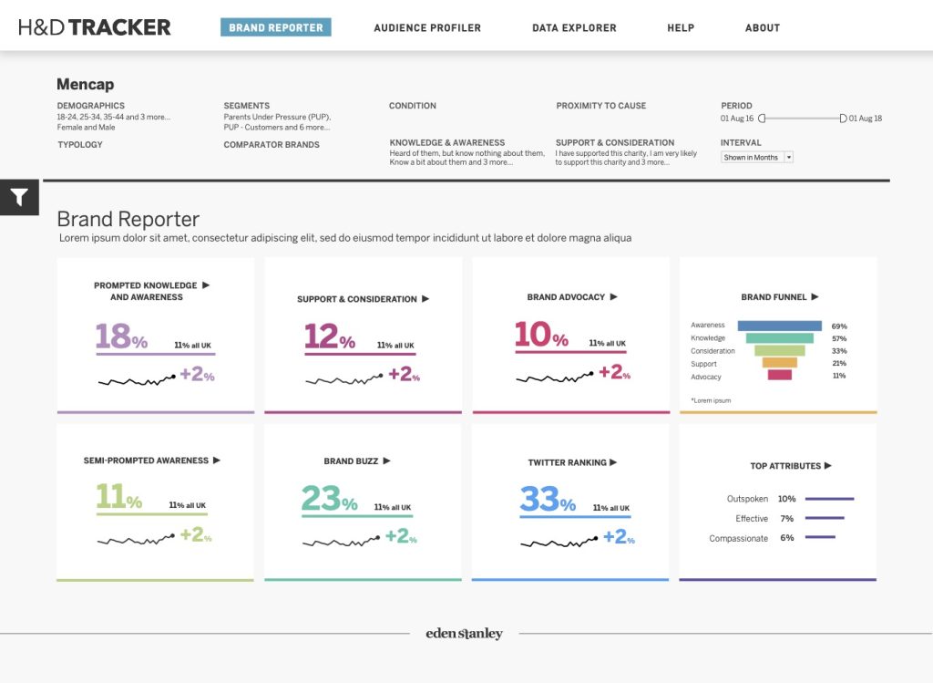
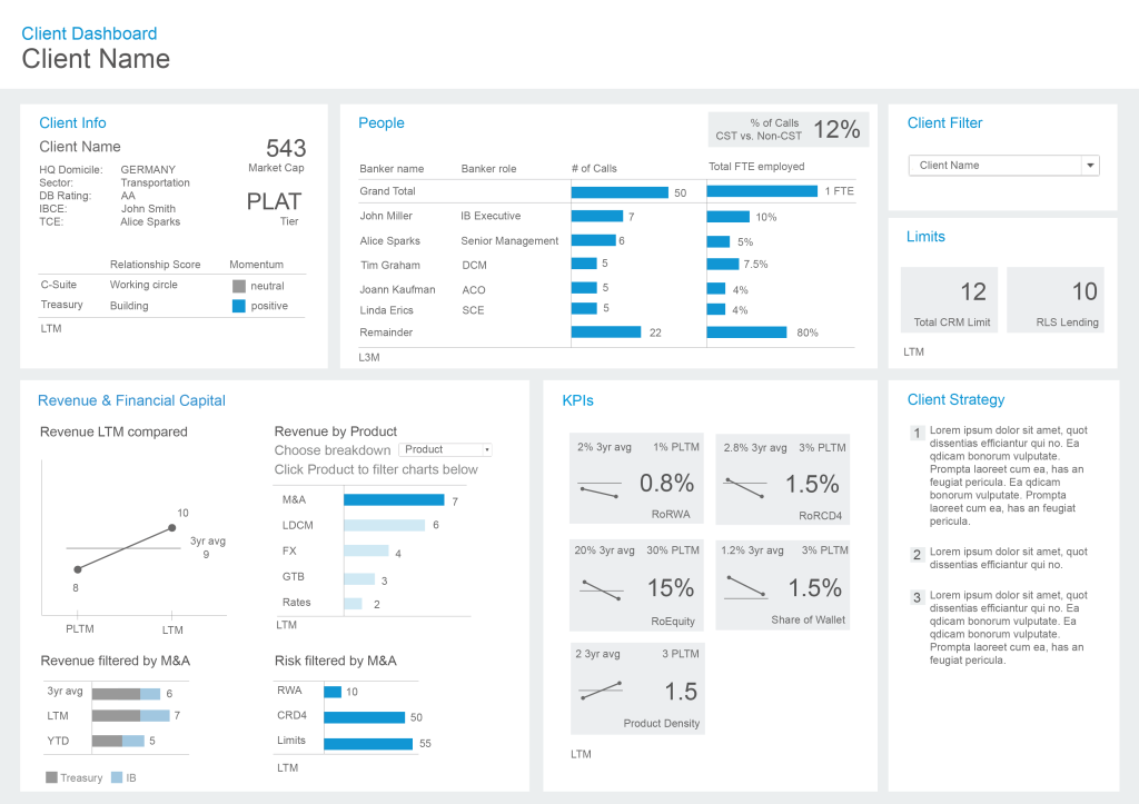
My current focus lies on Tableau dashboard design and development, where my purpose is to empower your organization and its users to harness the full potential of your data.
My mission is to elevate your analytical environment. I craft and construct optimized Tableau experiences, which you can trust, interwoven with aesthetic interfaces and robust data engineering, all geared towards addressing your users’ analytical demands.
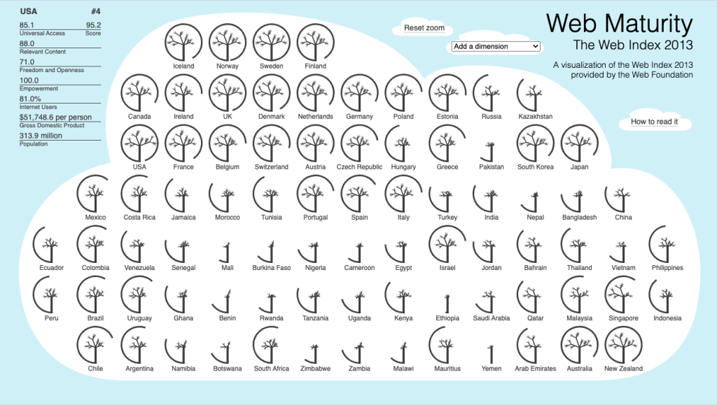
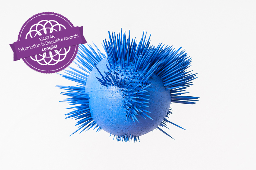
My data visualization journey has garnered notable recognition, including a feature in the book The Best American Infographics 2015 and a victory in the visualizing.org challenge Visualizing the Impact of the World Wide Web. I’ve proudly exhibited my work at the designtransfer gallery in Berlin and achieved a longlisting at the Kantar Information is Beautiful Awards. My Tableau visualizations have shone as Viz of the Day and Viz of the Week.