INEQUALITIES QUIPU


This project is about the revival of the ancient Incan Quipu. This project is about a comparison of well-being in Latin America and top leading countries in Scandinavia as assessed by the OECD Better Life Index. It shows the inequalities between those two cultures as well as between men and women visualised with the help of the Incan recording devise - the quipu.


quipu gif

Inspiration

While strolling through the web I discovered something so fascinating, that I fell in love with it immediately – the Incan quipu.

A quipu is a recording devise used by the Incas for collecting and keeping track of data. A quipu consists of cords containing numeric and other values encoded by knots in a base ten positional system. I found myself in immediate amazement. Such a beautiful and little abstract way of displaying information. Holding information from past times. Enduring time. I decided to revive the quipu. To combine ancient and modern. Modern questions of life with old ways of recording life.

High res version of the Scandinavia Quipu

High res version of the Latin America Quipu

Legend

The project

The project compares the well-being of Latin America represented by Chile (where settlements of the Incan empire lied, although the center was in Peru), Brazil and Mexico with Scandinavia, which is Norway, Sweden and Denmark. The data used is the data behind the Better Life Index by the OECD. The OECD has developed an index with 11 topics that measure the well-being of life beyond the cold number of the GDP. It allows to compare the well-being across the OECD countries in the areas of material living conditions as well as soft factors of quality of life.

Latin American countries are located at the bottom of the index whereas the Scandinavian countries are leading in the OECD Better Life Index. The work is about showing the details of the differences in well-being between those two cultural areas. It is also about gender inequalities within the cultures as well as between them.

quipu gif


Methodology

The basic materials for a quipu are colored cords. I prepared all the cords myself, which means twisting crochet yarn to create thicker cords. Each cord is at least two-ply and one end is looped while the other is tapered and finished with a small knot. The looped end makes it possible to connect the pendant cord to the top cord in this unique way.

I prepared two quipus - one for each area. The scores per each of the 24 indicators (that are summarised to the 11 sub-indices) as well as the overall scores respectively for the total population, as well as women and men are visualized with a single string. The individual values, that are behind the calculated index are encoded at the top of the indicator strings with knots. The color as well as the thickness are relevant properties that help to visually grasp the information.

I introduced another property, which seems to have been irrelevant for the original quipus, but which is for us nowadays a common way to read data. I introduced the length of the cords as a dimension for the value of the index scores. The longer the cord, the higher the score. This way the quipu turns into an inverted bar chart. So each string carries the information of the score, encoded with the length, and the actual values encoded with the Incan way of encoding infomation via the knots. The individual indicators are summarized to an overall topic score, which is represented by thicker cords. A quipu is read from left to right. At the beginning of it is the overall summarized score for the entire country, split up by total, men and women again.

The two resulting Quipus are made of over 180 hand twisted individual cords (where the thick cords consist of multiple thiner strings). In order to allow for comparison between countries as well as women and men, I calculated my own index using the data provided by the OECD. I normalised the data for the entire group of total, men and women, meaning using the Min and Max of all of those values in order to have comparability between the genders per indicator.


How to read quipu knots

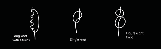
On each cord there are clusters of knots. Each cluster contains 0 to 9 knots and the clusters are seperated by spaces that distinguish one cluster from the next. The highest power is closer to the top cord. In the units position a special type of knots is used: long knots. In all other positions single knots are used. A specialty form of a knot has the 1 in the units position. It is represented by a figure eight knot, since long knots cannot be made with fewer than 2 turns. quipu gif

Colors

I found them in the sky. These are the colors of a sky with clouds at sunset. They are intuitively to grasp: apricot for women, blue for men and the mixture of both colors for the totals.

quipu gif

The two quipus are differentiated by the color of the top cord and the leading overall score cords: deep blue for Scandinavia and orange for Latin America.

PHYSICAL DATA VISUALISATION

The nature of an abstract visualization is that an accurate deduction of the data is difficult. It is rather intended to get an impression of the nature of the differences. This project is about an ancient method reborn into the new world. It’s about encoding digital data into analogue means. Going from fast to slow. I like the fact that this can possibly endure time and potentially can be found in hundred of years and tell a story of this special moment in time.

Physical data visualisation is data you can touch and experience physically with all of your senses. I am deeply fascinated by this, as it makes information accessible in an extraordinarily engaging way.


quipu gif

.


quipu gif quipu gif quipu gif

Made by

Ewa Tuteja
www.tuteja.info
@ET2point0

Made with

4.5 spools of crochet yarn

Share

Tweet

.